Kitchen colour ideas
Choosing a palette that lasts — cabinet colour schemes with the benchtop and splashback named, which colours suit low-light rooms, and how to be bold without dating.
Get a free quoteColour is the decision people agonise over most — understandably, because the cabinetry and benchtop are the expensive surfaces you live with for years. The good news is there's no single right answer, only the right answer for your light and your home. Below are schemes that work in New Zealand kitchens, each with the benchtop and splashback that complete them, so you can picture the whole room rather than just a cabinet colour.
Start with your light
Before any colour, look at the room. A sun-filled, north-facing kitchen can carry deep greens, navies and charcoals that would feel gloomy in a shaded space. A south-facing or low-light room wants warm, light colours — a warm white, soft greige or pale sage — and reflective surfaces to bounce what light there is. The same colour can look completely different between the two, which is why we test real samples in your actual room, at different times of day, before anything is decided.
Timeless neutral schemes
- Warm white + timber + stone: warm white cabinetry, a veined stone benchtop, a timber accent, and a quiet tiled splashback. Light, natural, endlessly liveable.
- Greige + waterfall stone: soft greige cabinetry with a stone benchtop that runs down the island ends, and a stone or glass splashback to match. Calm and modern.
- Off-white shaker + butler feel: off-white shaker doors, a timber or marble-look benchtop, and a subway-tile splashback. Classic, and suits villas and character homes.
Green kitchens
- Sage + warm white: pale sage lowers, warm white uppers, a light stone benchtop. Soft, characterful, and easy to live with — a favourite for a reason.
- Deep forest green + brass: a rich green on the island or a feature run, a pale benchtop for contrast, and brass handles. Confident, and lovely in a well-lit room.
Blue and moody schemes
- Navy + white + timber: navy on the lowers or island, white above, a white stone bench and a timber accent. Crisp and enduring.
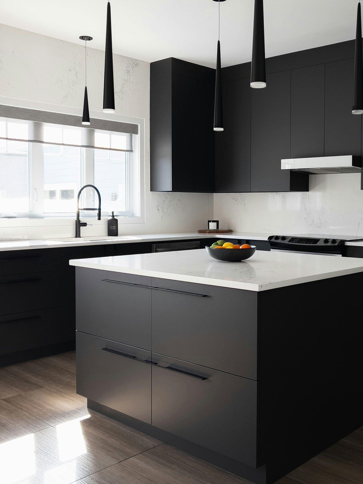
- Charcoal + pale stone: charcoal cabinetry lifted by a light, softly veined benchtop and good lighting. Drama without going fully black.
Coordinating the three surfaces
Whatever the palette, the rule is the same: one element leads, the others support. Usually the cabinetry sets the mood, the benchtop complements it, and the splashback either ties them together or disappears quietly. Make one surface the feature — a dramatic benchtop, or bold cabinetry — and keep the other two calm. Three statements at once is what makes a kitchen feel busy. A two-tone approach is a controlled way to introduce a second colour without overwhelming the room.
Being bold without dating
The way to use colour fearlessly is to put the trends where they're cheap to change. Keep the cabinetry and benchtop in colours you'll still love in ten years, and express the moment through the splashback, handles, bar stools and accessories — all easy and inexpensive to swap. That way the bones of the kitchen stay timeless while the room can move with the times.
Match it to a colour you love
Because our cabinetry is made to order, we can colour-match painted fronts to Resene or Dulux colours — so your kitchen can pick up a tone from elsewhere in your home or a colour you've had your eye on. We'll test the match on a sample in your own light, show the whole scheme in 3D, and build it in our Rotorua factory, with a fixed written quote before any work starts. Not sure where to start? Our white, black and two-tone guides each go deeper on a direction.
Frequently asked questions
What's the best colour for a kitchen?
What kitchen colours suit a low-light room?
How do I coordinate cabinetry, benchtop and splashback?
Are coloured kitchens a risk compared to white?
Can you match cabinetry to a specific paint colour?
Find a kitchen colour scheme you'll still love in ten years
We'll test real samples in your own light, coordinate cabinetry, benchtop and splashback, and build it in our Rotorua factory — with a fixed written quote before work starts.